When is Style Substance?
While we are all aware of our ability to judge a book by its cover, our critical eye extends beyond the face of the book and to the font it is printed in as well. Strictly speaking, font refers to the size, weight, and style of a particular letter, while typeface refers to the overall style and design of the script. The term font comes from the days of physical printing; the font was the metal stamp used for each particular letter. Physical fonts have become antiquated by the advent of digital printing, but in common vernacular, font has remained the term most strongly associated with typography. [1]
Whether or not people are aware of it, typeface impacts how a reader perceives the information.[2] While the general public might not know the difference between a font and a typeface; a serif and sans serif[3]; or blackletter[4] and roman[5] typefaces; studies show a difference in how individuals perceive information based on these distinctions.[6]
As writing was one of the most efficient ways to reach the masses, selecting an appropriate typeface was naturally an important way to convey the character of the information. In the early days of printing, the more ornate “blackletter”[7] (also known as gothic or old English script) typeface, which more closely resembled handwritten calligraphy script, was the most common. During the 16th century, it gradually fell out of favor in much of Europe. Some postulate that as printing became more widespread, printers moved from the curved blackletter fonts to Roman fonts inspired by the inscriptions found on Roman capitals and the Holy Roman Emperor Charlemagne’s script system, as it was easier to create the metal forms for the simpler style .[8]
Regardless of its exact origins, the now so-called “roman” typeface became a staple for the printing industry by the late Renaissance. The more formal blackletter style became mostly relegated to formal governmental proclamations and religious texts.[9] Roman-style fonts continued to further evolve, and by the early 19th century, a new style appeared, now referred to as sans serif.[10] This leads to the modern day, where lawyers and courts now have hundreds of styles to choose from. The question becomes, do these stylistic choices in some way affect the fairness of the judicial system?
While the message of the writing stems mainly from the words themselves, how they are presented is certainly important. This is something the Fifth Circuit certainly understood when it redesigned its official publication formatting in 2020.[11] Judge Don R. Willett, a member of the Committee on Typography and Style tasked with the redesign, emphasized this explicitly, referring to the rebranding of Air Force One by saying “JFK understood something that lawyers—advocates and judges alike—too often overlook: style matters.”[12] The Circuit Court took this to heart through its bold redesign.
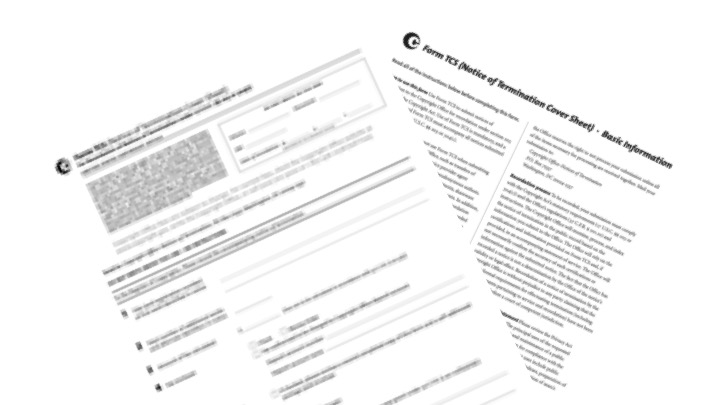
The change introduced a bold, 24-point Gothic typeface for the header, a proprietary typeface, wider margins, the use of full and complete party names, along with the use of “versus” in place of the more common “v.”[13]
See Figure 1. [14]
Collectively, these changes create a more formal document, imposing a heavy gravitas to any publication. Among these changes though, perhaps the adoption of Equity is the star of the show. Equity is a typeface designed by American typographer (and lawyer) Matthew Butterick, specifically for legal writing.[15] The typeface is sold directly by Mr. Butterick, with a licensing fee starting at $119 for 1–2 users, though it is not disclosed how much the court pays for access to the proprietary typeface. Hearing Judge Willett describe it, even a high cost may be worth paying. The Texas native compared the typeface to “a Rolls-Royce (or better, a fully loaded Ford F-150)”, calling it “visually elegant” and highlighting its “heft[,] authority and professionalism”.[16]
See Figure 2. [17]
The typeface is reminiscent of Times New Roman, with a similar width and point size, but features a bolder line that creates a softer, darker text. While Judge Willett’s passion for typography and puns[18] is infectious, there are some concerns raised by these changes. As Judge Willett himself points out “Equity makes good writing more readable and bad writing more tolerable” and “[g]ood style underscores substance, and bad style undermines it.”[19] With these principles in mind, the next logical question is how lawyers might utilize a document’s style to their advantage. While Judge Willett is careful to emphasize that the content of the words is more important than their presentation, his praises cut both ways. What advantage might a lawyer who is able and willing to pay extra for their own license of Equity have over the one who does not, not to mention over a pro se litigant?[20]
While there is no standard requirement among jurisdictions for written documents submitted to the court, many have adopted Rule 32 of the Federal Rule of Appellate Procedure, which requires 14-point, plain, Roman style, serif, double-spaced formatting.[21] These guidelines allow for relative flexibility when deciding on a typeface, but in a world where formatting can doom an argument,[22] every advantage is worthwhile lest you draw the court’s displeasure.[23]
Legal proceedings are seen by many as convoluted, elitist, bureaucratic, and sometimes Kafkaesque ordeals governed by petty or arbitrary rules.[24] While courts often do grant leeway in cases of minor procedural issues, particularly to pro se litigants, the letter of the law holds them to the same standard as any lawyer.[25] The complicated system of state and federal courts, many of which have their own style requirements, only makes the task of representing oneself even more challenging.
While it may seem like a minor change, style guidelines for courts matter because they impact both the accessibility of the court system and the perception of the general public.[26] With this in mind, would more limited requirements help equal the disparity? Though making the style guidelines too restrictive may prevent some litigants from being able to comply, requiring one of only a couple of publicly available fonts may be a way to remove variables from the already complex process of judicial ruling.
Jordi Fernandez Servitje is a Second Year Law Student at the Benjamin N. Cardozo School of Law and a Staff Editor at the Cardozo Arts & Entertainment Law Journal. His academic background is primarily focused on English Literature and Real Estate.
__________________________________________________________________________________
[1] James M. Wells, Typography, Encyclopædia Britannica, https://www.britannica.com/technology/font (last accessed Apr. 8, 2026).
[2] See Katherine Haenschen & Daniel J. Tamul, What’s in a Font?: Ideological Perceptions of Typography, Communication Studies (Dec. 20, 2019), https://doi.org/10.1080/10510974.2019.1692884; Sarah Hyndman, The Ultimate Font Face-Off: Serif vs Sans Serif in the Psychological Battle of Font Personalities, Medium (Feb. 16, 2023), https://shyndman.medium.com/the-ultimate-font-face-off-serif-vs-sans-serif-in-the-psychological-battle-of-font-personalities-87af8f8c1916.
[3] Shown in Microsoft’s current default office typeface “Aptos”, which they describe as a “precise, contemporary sans serif typeface inspired by mid-20th-century Swiss typography. Its clear-cut stroke endings emphasize order and restraint; the points where curved strokes meet straight strokes are crisp and well defined, which makes the typeface easily readable and reduces visual crowding.” Microsoft Typography: Aptos Font Family, Microsoft (July 25, 2025), https://learn.microsoft.com/en-us/typography/font-list/aptos.
[4] Typeface used is “Lucida Blackletter”. Described by Microsoft as a “modern interpretation of a cursive blackletter style used for printing in the 15th and 16th centuries”. Copyright attributed to Bigelow & Holmes Inc. Microsoft Typography: Lucida Blackletter Font Family, Microsoft (Mar. 30, 2022), https://learn.microsoft.com/en-us/typography/font-list/lucida-blackletter.
[5] Typeface used is “Times New Roman” in small caps. One of the most used typefaces, it was developed in the 1930’s for The Times of London newspaper. While originally designed for the short lines created by the dense newspaper’s columns, it has been reworked throughout its history and become one of the most popular fonts for publishing of all kinds. See Meredith Mann, Where Did Times New Roman Come From?, The New York Public Library (Dec. 9, 2014), https://www.nypl.org/blog/2014/12/09/times-new-roman; Microsoft Typography: Times New Roman Font Family, Microsoft (July 25, 2025), https://learn.microsoft.com/en-us/typography/font-list/times-new-roman.
[6] Katherine Haenschen & Daniel J. Tamul, What’s in a Font?: Ideological Perceptions of Typography, Communication Studies (Dec. 20, 2019), https://doi.org/10.1080/10510974.2019.1692884, (“[S]erifs are viewed as more conservative than sans serifs, blackletter is the most conservative, scripts are slightly more liberal than serifs, and the cartoonish display typeface is perceived to be the most liberal of all.”).
[7] Typeface used is Lucida Blackletter. Described by Microsoft as a “modern interpretation of a cursive blackletter style used for printing in the 15th and 16th centuries”. Copyright attributed to Bigelow & Holmes Inc. https://learn.microsoft.com/en-us/typography/font-list/lucida-blackletter.
[8] Note that there is some debate as to the origin of Roman letters, as some believe they only inspired the capital letters and that lowercase letters derived from other sources, such as Charlemagne’s later attempts to uniformize his empire’s alphabet. See Alec Wilkinson, Man of Letters: Matthew Carter’s life in type design, The new Yorker (Nov. 28, 2025), https://www.britannica.com/technology/typography (“The capital letters derived from inscriptions on Roman monuments, and the smaller letters from handwriting.”); Riccardo Olocco, The Venetian Origins of Roman Type, Medium (Dec. 19, 2017), https://articles.c-a-s-t.com/the-venetian-origins-of-roman-type-a856eb3f0cb (“Historians now trace its ancestry less to Rome than to Charlemagne and the “official” letter form developed for his decrees by an English monk.”).
[9] See e.g., Queens’ College, Queens’ College Old Library’s Copy of the 1611 King James Bible and the Mystery of Ruth 3:15, https://queenslib.wordpress.com/2012/11/14/queens-college-old-librarys-copy-of-the-1611-king-james-bible-and-the-mystery-of-ruth-315/ (last accessed Apr. 7, 2026).
[10] The name comes from the French term “sans” meaning without and derives the style’s removal of the small flourishes at the ends of many letters, called serifs. Now seen as modern, it rose to prominence in the post-war period, it has become associated with more progressive attitudes, successfully disavowing its own 20th century association with a fascist dictator. See Peter Biľak, A Brief History of Sans Serif Typefaces, Typotheque (Mar. 11, 2019), https://www.typotheque.com/articles/a-brief-history-of-sans-serif-typefaces; Ben Hersh, How Fonts Are Fueling the Culture Wars, Wired (May 22, 2017), https://www.wired.com/2017/05/how-fonts-are-fueling-the-culture-wars/.
[11] Shane Pennington, Fifth Circuit Review – Reviewed: New Look, Same Great Taste!, Yale Journal on Regulation (July 28, 2020), https://www.yalejreg.com/nc/fifth-circuit-review-reviewed-new-look-same-great-taste/.
[12] Don R. Willett, A Court of Equity: There’s A New Serif in Town, The Advocate 40, 42. (couldn’t find but probably need the link here).
[13] Id. at 42.
[14] Compare past format on the left with new changed implemented on the right. Image taken from Don R. Willett article. Id. at 43.
[15] Matthew Butterick, Typography for Lawyers: Essential Tools for Polished and Persuasive Documents, (2nd ed. 2010) https://typographyforlawyers.com.
[16] Willet, supra note 13, at 40–42.
[17] Figure 2. Close up comparison between Times New Roman and Equity. Ameel Khan, Times New Roman Alternatives, Insanity Works (Mar. 31, 2024), https://www.insanityworks.org/randomtangent/2024/3/31/times-new-roman-alternatives.
[18] Highlights include: “some may say Equity isn’t their, um, type”, “I fully expected all Helvetica to break loose” and of course the titular “There’s A New Serif in Town”. Willet, supra note 13, at 42.
[19] Id.
[20] Surely submitting one’s argument in the Rolls Royce of fonts couldn’t hurt.
[21] Fed. R. App. P. 32.
[22] See White Budd Van Ness P’ship v. Major-Gladys Drive Joint Venture, 811 S.W.2d 541, 541 (Tex. 1991) (denying the submission of petitioner’s brief as it was formatted in such a way that complied with the rules but was difficult to read and deemed to violate the “spirit . . . if not the letter of the rule[s]”); Kano v. Nat’l Consumer Co-op. Bank, 22 F.3d 899, 899 (9th Cir. 1994) (rejecting a brief because it violated Fed.R.App.P. 32(a) by using a smaller point size and 1.5 spaced line spacing instead of double-spacing).
[23] AsymaDesign, LLC v. CBL & Assocs. Mgmt., Inc., 103 F.4th 1257, 1260 (7th Cir. 2024) (chastising the attorney for his use of Bernhard Modern in his brief and recommending several other typefaces for attorneys); Aaron G. McLeod, Your Brief is Headed to Court. Dress It Up, Adams and Reese (Aug. 1, 2024), https://www.adamsandreese.com/insights/your-brief-is-headed-to-court-dress-it-up.
[24] Luka Baramidze, The “Kafkaesque” in Judicial Reasoning: A Comparative Review of American and European Practices, 2 Copernican J.L. 9, 11 (2025).
[25] Muhammed v. Lone Star Coll. Sys., 460 F. App’x 341, 342 (5th Cir. 2012) (holding that even though they “‘liberally construe’ the filings of pro se litigants and ‘apply less stringent standards to parties proceeding pro se than to parties represented by counsel,’ pro se appellants must still comply with the principles of appellate procedure.”).
[26] This is without even considering the accessibility concerns for those with certain visual and learning disabilities.
Figure 1

Figure 2